Octicons
A scalable set of icons handcrafted by GitHub.
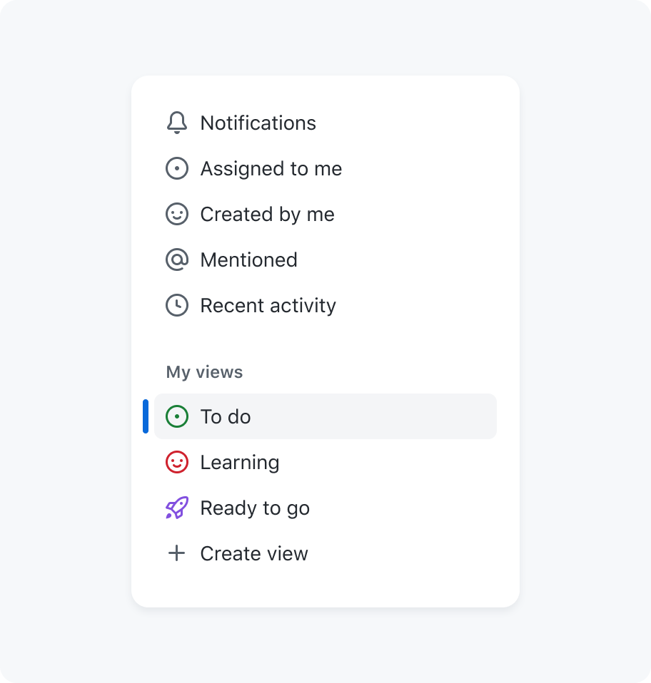
Octicon nav items navigation
Icons are most appropriate for representing simple, recognizable concepts or actions. When choosing icons for your design system, consider the following guidelines:
- Where possible use icons to supplement text, rather than replacing it.
- Make sure that the meaning of icons is clear when used without accompanying text.
- Choose icons that are easy to recognize and accurately depict the concept or action.
- Maintain consistency in the use of icons across your product or brand.
- Avoid using icons for complex or abstract concepts that may be confusing to some users.
- Adhere to predetermined icon sizes to ensure legibility and ease of recognition.
- Test the effectiveness of your icons with users to ensure that they are understood and useful in navigating the interface.
Color
To ensure that icons are effective and legible in different color modes, it is recommended to use our functional foreground colors.
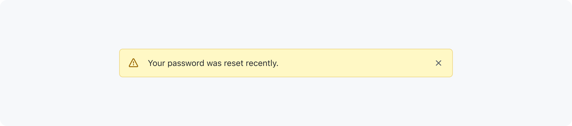
Many of our components are designed to automatically set the color of icons to a predetermined color. For example, banners are configured to set the icon to the matching role color by default.
Some icons should always be shown in a specific colors when used within a specific context. This helps to effectively convey their intended meaning and provide a consistent user experience. Here are a few examples:
| Example | Icon | Color variable | Usage |
|---|---|---|---|
| info | fg.accent | Important information | |
| check | fg.success | Successful, passing, or positive result | |
| x | fg.danger | Error, danger, or negative result | |
| alert | fg.attention | Warning |
Specific use cases
Certain Octicons are designed for specific use cases and their meaning should not be changed. Most icons also have a predefined color variable, those should not be changed unless placed on colorful/dark backgrounds like buttons. In this case the fg.onEmphasis color can be used. Please refer to the table below for icons with specific guidelines.
| Example | Icon | Context | Color variable | Usage |
|---|---|---|---|---|
| git-commit | Commit | fg.muted | Individual or groups of commits. | |
| issue-opened | Issue | fg.success | A newly opened issue that needs attention. | |
| issue-closed | Issue | fg.done | A done/closed issue. | |
| issue-reopened | Issue | fg.success | A reopened issue. | |
| issue-draft | Issue | fg.muted | A draft issue. | |
| git-pull-request | Pull request | fg.success | A new unmerged pull request that needs attention. | |
| git-pull-request-closed | Pull request | fg.danger | A closed pull request that wasn't merged. | |
| git-pull-request-draft | Pull request | fg.muted | A draft pull request. | |
| git-merge | Pull request | fg.done | A merged request. | |
| repo | Repository | fg.muted | A public repository. | |
| repo-locked | Repository | fg.attention | A private repository. Not to be confused with lock. | |
| mark-github | Branding | fg.default | See our GitHub brand guidelines. | |
| logo-github | Branding | fg.default | See our GitHub brand guidelines. |
Sizes

Octicons are available in three sizes: 12px, 16px and 24px. To maintain consistency in stroke width and legibility, it is important to use these icons only at their designated sizes.
The smaller set of 12px icons is available for use in specific, condensed user interface contexts. These icons are listed below and should only be used in the appropriate context.
| Example | Icon | Usage |
|---|---|---|
| alert-fill | For cautionary messaging or to inform the user that an action requires attention | |
| check-circle-fill | For positive messaging to inform the user that an action is successful, complete, or that they may continue through a workflow | |
| no-entry-fill | Indicate an ending or that the user is blocked and cannot continue | |
| x-circle-fill | For negative messaging to inform the user that an error has occurred as a result of an action or an action is unavailable | |
| chevron-down | Indicates that a collapsible section is currently open | |
| chevron-right | Indicates that a collapsible section is currently closed |
Maintaining the original size of icons is important for visual consistency, legibility, accessibility, and simplifying the design process. Resizing icons should be avoided.
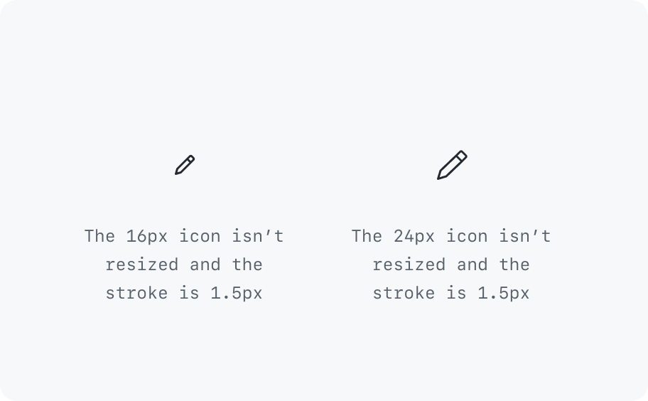
Keep icons in their original size.
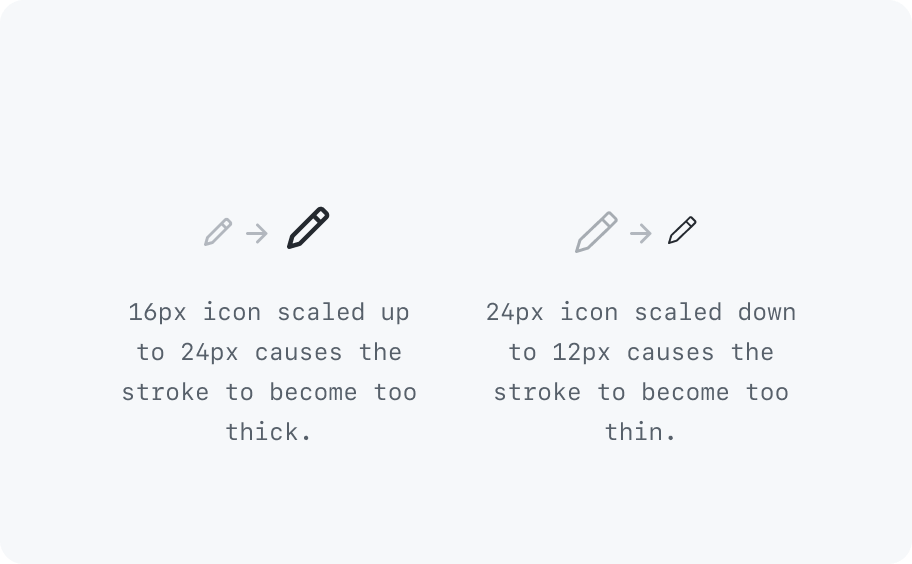
Don't resize icons.
System vs user-selectable
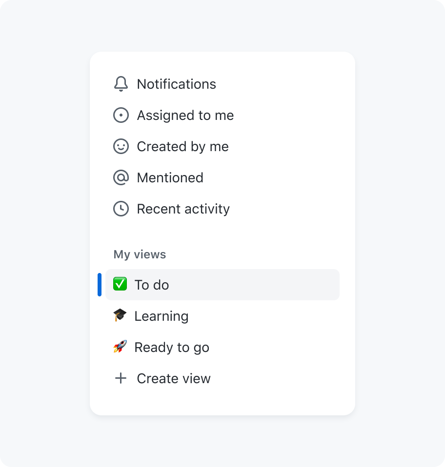
There are two types of icons: system and user-selectable icons.
System are used to represent core actions and concepts within the user interface. These icons are typically used consistently throughout the product and are an important part of our visual language. Examples of system icons might include a trash icon for deleting items, or a plus-circle icon for adding new items.
User-selectable icons, on the other hand, are used to allow users to customize their experience or make a personal connection with the product. User-selectable icons are typically less central to the functionality of the user interface and may be changed by the user as desired.
At GitHub we currently use emojis as user-selectable icons as they are widely recognized and understood, making them an effective way to convey emotions or personality. One benefit of using emojis as user-selectable icons is that they are visually distinct from the system icons used in the design system. This helps users to easily understand that the emojis are optional and can be selected by the user, rather than being a part of the core functionality of the user interface.
Using Octicons as user-selectable icons is strongly discouraged as that could create a confusing experience when used in the wrong context. For example, a user could pick a issue-closed icon and use the label In progress.
Use emojis as user-selectable icons.
Don't use Octicons for user-selectable icons.
States
To display the state of an action, use a stroke and fill icon combination or its opposite version if available. For "off" or "empty" states, use the outline icon.
Predefined pairs
| Example | Icons | Usage |
|---|---|---|
| / | heart / heart-fill | Sponsor / Sponsoring |
| / | star / star-fill | Star / Unstar |
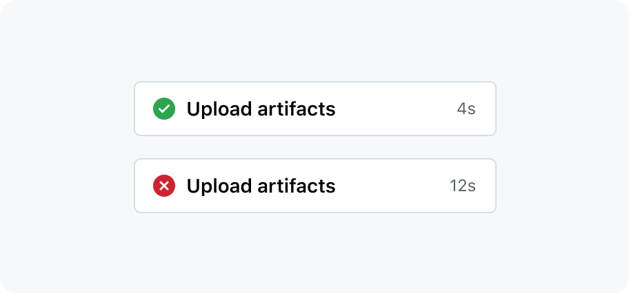
| / | check-circle / x-circle-fill | Pass / Fail |
| / | file-directory-open-fill / file-directory-fill | Directory open / Directory closed |
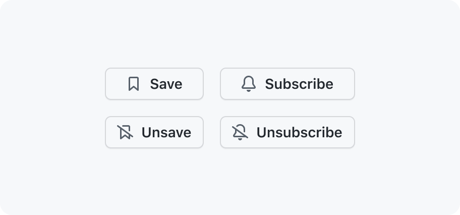
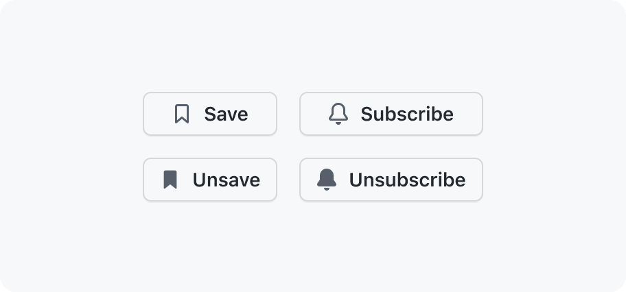
| / | bell / bell-slash | Subscribe / Unsubscribe |
| / | bookmark / bookmark-slash | Save / Unsave |
| / | eye / eye-closed | Watch / Unwatch |
| / | cloud / cloud-offline | Cloud online / Cloud offline |
Maintaining consistency by adhering to the predefined pairs is important to avoid inconsistencies, as demonstrated in the following examples
Stick to predefined icon pairs.
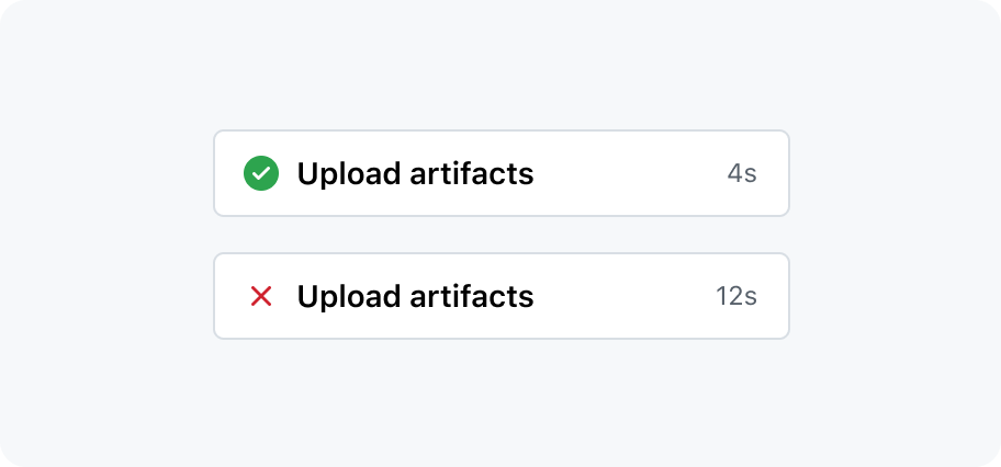
Create your own icon pairs.
For "off" or "empty" states, use the slash icon.
Don't use filled icons for representing "off" or "empty states".
Creating new icons
If you are unable to find the icon you need in our Octicons library, you may want to create a new icon. Follow our Octicons design guidelines for guidance on creating a new icon that fits with the visual language of our design system. Keep in mind that new icons should be added only when they are necessary and meet the guidelines for use.
Accessibility and usability expectations
If the icon is purely decorative and does not convey any meaning (for instance, if adjacent text already provides all the necessary information/context), it is hidden from screen readers.
If the icon does convey meaning, the component exposes a role="img" so that its purpose will be described by assistive technologies, and the component's aria-label contains the accessible name / text alternative for the icon.
The accessible name or decision to make it decorative should be included in the design annotation.
Unless the icon is purely decorative, it must have a contrast ratio of at least 3:1 against the background color.
Built-in accessibility features
If the author does not include an aria-label, the component is assumed to be decorative, and will automatically be given an aria-hidden="true" attribute.
If the author includes an aria-label, the component exposes a role="img", and the aria-label attribute is passed to the rendered component.
Implementation requirements
- If the icon is decorative, omit the
aria-labelattribute. - If the icon is used to convey information or meaning, make sure to add an appropriate
aria-labelthat provides the text equivalent for the icon.
Authors can choose the color used for the icon, so it is important to ensure that it has a contrast ratio of at least 3:1 against the background color. It is recommended to use our functional foreground colors.