ActionMenu
ActionMenu is composed of ActionList and Overlay patterns used for quick actions and selections.
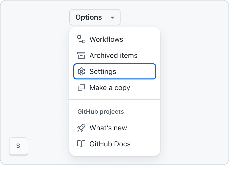
Page navigation navigation
When an ActionMenu is opened, focus moves to the first item in the menu.
Users can move between the different menu items – and, if present, submenus – using cursor keys.
If a keyboard user navigates away from an open ActionMenu using Tab / Shift+Tab, the ActionMenu is closed.
An open ActionMenu can be closed using Esc.
Menu items must have a clear and descriptive label. The label is the visible content of the button and will usually be text. The label should be concise and descriptive of the action that will be performed when the menu item is activated.
When using Octicons for leading and trailing visuals on individual menu items, note that icons don't have any text alternative. They are purely visual, and not conveyed to screen readers. Don't rely on these icons alone to convey meaning – make sure that the text label of the menu item provides sufficient meaning/context on its own.
Every menu item must have a minimum target size of 24×24 CSS pixels. This is to ensure that the button is large enough to be easily activated by users with motor impairments.
The currently focused menu item can be activated using Space or Enter. When a menu item is activated, the ActionMenu is closed, and the relevant functionality is executed. In the case of selectable menu items, the focused item is checked/unchecked, and the ActionMenu is closed.
When the ActionMenu is closed, focus returns to the most logical location in the page – in general, this is the trigger control that originally opened the ActionMenu.
See focus management for more information.
Menu mnemonics
When a menu is open, hitting a letter key for the first letter in an item to be selected will move focus to that item. If two items have the same first letter, the first item in the list will be focused first, and hitting the letter key again will focus the next item.
Inactive menu items vs disabled menu items
Inactive menu items must still be focusable and may execute actions, so they should not be marked as disabled using aria-disabled. For example, they might trigger a modal with information about an outage, which is still a valid action.
This behavior is consistent with the behavior of inactive buttons. See the Button component accessibility guidelines and inactive button guidelines for more details.
Inactive menu items:
- Need to be able to get focus so screen reader users can "read" the message about it being inactive
- Can be activated
Disabled menu items:
- Do not get focus
- Cannot be activated
Built-in accessibility features
The component handles all aspects of focus management and keyboard interaction.
The role ("menu") and structure of the ActionMenu are correctly conveyed to screen readers – including the state of selectable menu items, and the correct association of grouped items with their group title/label.
Menu items meet the minimum target size requirement, 24px × 24px.
Keyboard navigation
Trigger button
| Key | Action |
|---|---|
| Enter | Opens the menu. |
| Space | Opens the menu. |
| ArrowDown | Opens the menu. |
| ArrowUp | Opens the menu. |
| ArrowLeft | Opens the menu. |
| ArrowRight | Opens the menu. |
Menu items
| Key | Action |
|---|---|
| ArrowUp | Cycle through items starting with current item to previous item |
| ArrowDown | Cycle through items starting with current item to next item |
| ArrowLeft | Closes submenu and sets focus back to the parent item |
| ArrowRight | Opens a submenu |
| Enter | Triggers the focused item |
| Space | Triggers the focused item |
| Home | Move focus to first item |
| PageUp | Move focus to first item |
| End | Move focus to last item |
| PageDown | Move focus to last item |
| Esc | Close menu |
Implementation requirements
The ActionMenu allows the use of inactive controls – controls that can still be focused, and even activated (for instance, to trigger an informative modal dialog informing the user why a particular item is marked as inactive). Currently, this state of a menu item is not conveyed programmatically, meaning that screen readers won't announce that an item is inactive. Make sure to include descriptive inactiveText to an inactive menu item, to clearly explain the status of the item to all users – and in particular, screen reader users, who won't otherwise be informed of the fact that an item is inactive.
How to test the component
Integration tests
- The menu items have sufficiently descriptive labels
- If menu items include icons for their leading or trailing visuals, the purpose of the items is clear even without the icons (as these are only decorative and are not conveyed to screen reader users)
- When using an
inactivemenu item, provide a descriptiveinactiveTextthat explains why the item is inactive
Component tests
- The component exposes an appropriate set of
role,aria-*attributes, and overall structure in its rendered output:- the component itself has a
role="menu" - each item within the menu has a
role="menuitem",role="menuitemcheckbox, orrole="menuitemradio - when items are grouped into sections, each section is identified using a container with
role="group, and the group has an accessible name (either usingaria-labelor referencing an existing element witharia-labelledby) that matches the visible section label - selectable items have an
aria-checkedattribute, and correctly reflect their state (aria-checked="true"when checked,aria-checked="false"when not checked)
- the component itself has a
- When a menu is opened, focus moves to the first menu item
- The correct keyboard interactions have been implemented
- The menu can be closed using
Esc - When moving keyboard focus away from the menu (using
Tab/Shift+Tab) the menu is closed - When a menu item is selected, the menu is closed
- When the menu is closed, focus is programmatically moved back to the most appropriate element in the page – in general, the trigger element that opened the menu; this does not apply when the menu was closed as a result of a keyboard user explicitly navigating away from the menu (using
Tab/Shift+Tab) - When a menu item is
disabled, the item hasaria-disabled="true", but still receives focus - When a menu item is
inactive, the item still receives focus
Refer to the W3C ARIA Authoring Practices Guide for menu button and actions menu button.