Dialog
Dialog is a floating surface used to display transient content such as confirmation actions, selection options, and more.
Page navigation navigation
Modal Dialogs must be announced as dialogs by screen readers and have an accessible title concisely describing the contents or purpose of the Dialog. The title must be visually displayed.
On opening, focus should move to the first focusable element inside the modal, with focus locked within the modal until it's closed. The underlying page should be hidden from screen readers to prevent unintentional navigation.
Each modal requires a visible close option, typically an "X" button, or specific controls (e.g., "OK" / "Cancel"). When closed, focus returns to the element that triggered the modal.
Trigger Elements and Keyboard Focus
Dialogs are opened by a trigger element (usually role="button") and should be fully operable by keyboard. Pressing Esc or clicking the backdrop closes the Dialog and returns focus to the trigger.
When opened, focus goes to the first interactive element, usually the close button or an input field in cases like command palettes. Tab cycles focus within the modal, and Esc or backdrop click exits. Scrolling on the page is disabled while the Dialog is open.
Clicking the backdrop or hitting the Esc key should dismiss the Dialog.
When a Dialog is opened, the first interactive element (typically the close button) is focused. For a scenario like a command palette with an <input> next to the close button, the <input> will recieve focus first. Hitting Tab will cycle through all interactive elements within the Dialog. To escape the focus trap, hitting the Esc key or clicking on the backdrop will close the Dialog. While the Dialog is open, page scrolling is disabled and becomes inert.
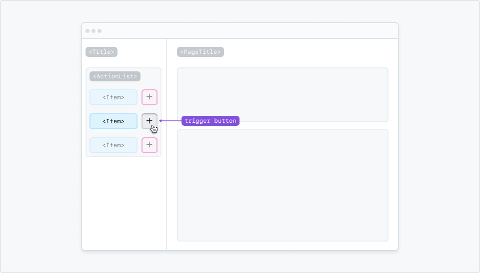
Dialogs can be triggered by buttons with a mouse click or keypress.
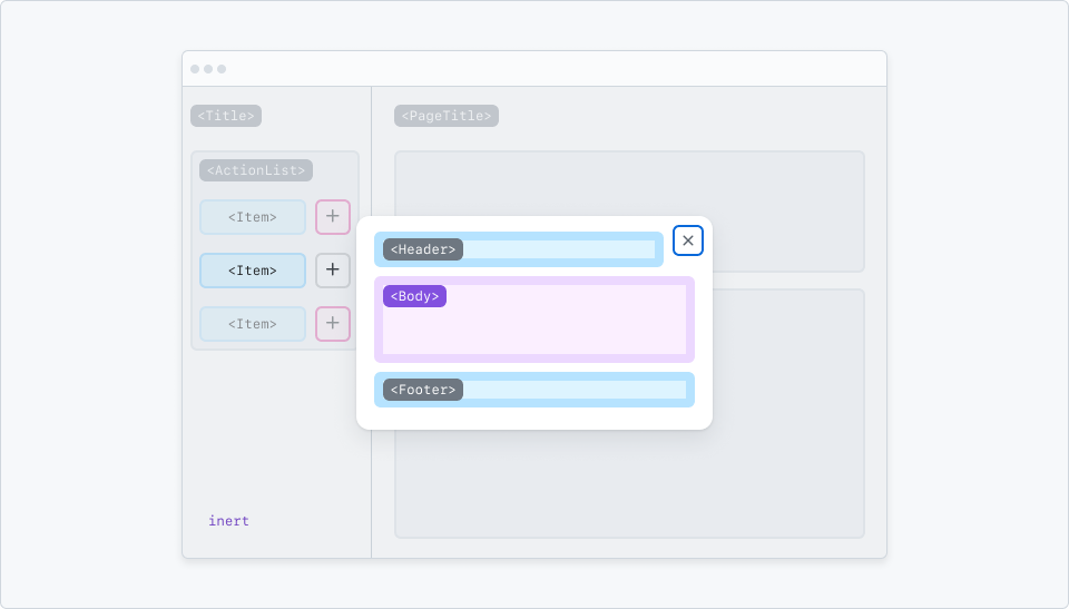
The first interactive item inside a Dialog is focused when opened.
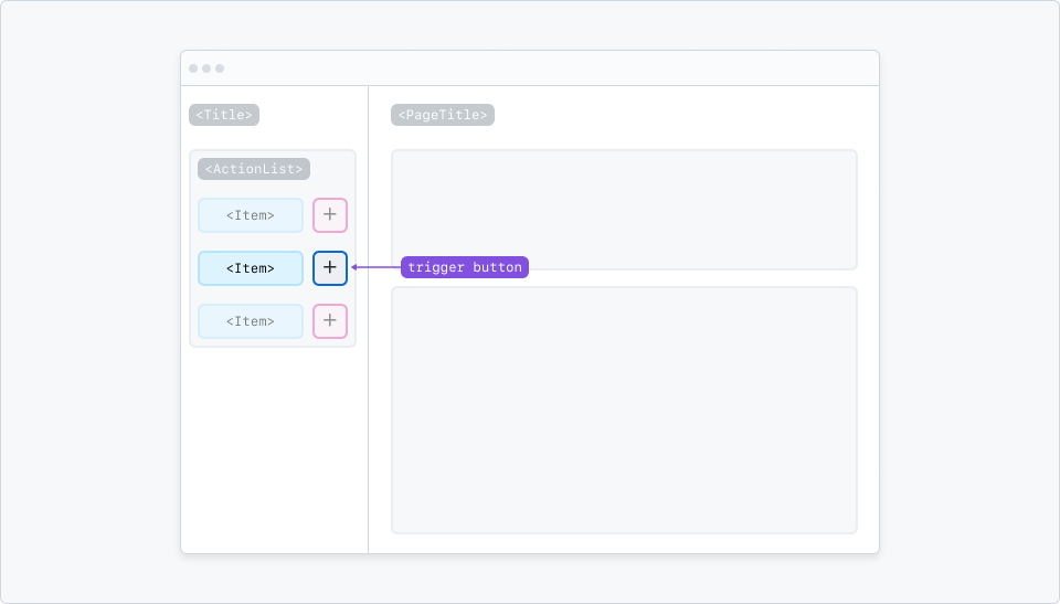
When a Dialog is closed, focus is returned to the trigger button.
Live region usage
Use extra caution when utilizing a live region that exists outside of the <Dialog> component.
This is because some browser and screen reader combinations may ignore the live region entirely if it does not already exist within the dialog.
If you need to use a live region while a dialog is active, place the live region within the dialog, rather than outside of it.
Built-in accessibility features
The Rails version of the component generates a <dialog> element with aria-modal="true".
The React version of the component generates a <div> element with role="dialog" and aria-modal="true".
When provided, the title prop for the component is rendered as an <h1> heading, and is explicitly referenced by the dialog using aria-labelledby to provide an accessible name for the dialog.
By default, the generated dialog includes an "X" graphical close control, which receives focus automatically when the dialog is opened.
In the Rails version of the component, you can use the autofocus property on interactive elements in the dialog's content to move the initial focus directly to a specific control. However, you should carefully consider when this approach is necessary – in general, it is best to keep dialogs consistent and let focus go to the "X" close control.
Focus is maintained inside the dialog. The aria-modal="true" on the dialog hides the underlying page from screen readers.
When the dialog is closed, focus is automatically moved back to the last element in the underlying page that had focus - generally, the control the triggered the dialog.
Implementation requirements
Make sure to provide a sufficiently descriptive title for the modal dialog. The title should concisely describe the contents or purpose of the modal.
In cases where the original trigger element that opened the dialog is not present in the page any more, or where the dialog was not opened as a result of a user action, you will need to explicitly handle which element will receive focus programmatically once the dialog is closed.
Integration tests
- The modal dialog has a sufficiently descriptive title rendered has a heading rendered as an
<h1>heading - Once the dialog is closed, focus is returned to the most appropriate location in the page
Component tests
- The modal dialog programmatically exposes its role - either using
<dialog>orrole="dialog" - The modal dialog programmatically conveys that it is modal with
aria-modal="true" - The
titleprop of the component is rendered as an<h1>heading, that it has anidattribute, and that thisidis referenced from the dialog container itself witharia-labelledbyto provide an accessible name - When the modal dialog is opened, focus is moved into the dialog - generally, to the first focusable control inside the dialog
- In the Rails implementation, the control specified by the author with
autofocusreceives focus when the modal dialog is opened - Focus remains inside the dialog - using
Tab/Shift+Tabmust not result in focus landing in the underlying page - When the modal dialog is closed, focus is returned to the last element in the underlying page that was focused at the time the dialog was opened - typically, this will be the trigger element that opened the dialog