UI Patterns
Design guidelines covering common user workflows.
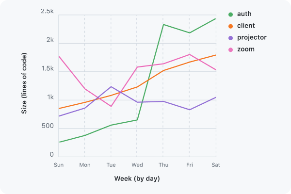
Data visualization
Data visualizations are helpful tools for conveying complex data in an engaging and understandable way. They're commonly used in dashboards and insights pages.
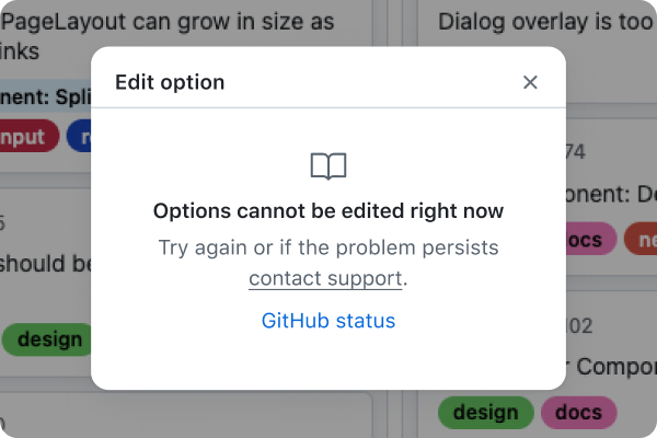
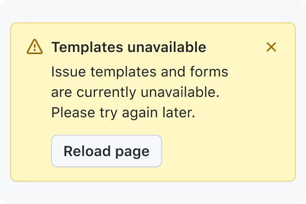
Degraded experiences
Ensuring that a page still renders and primary experiences are still available during downtime of optional service dependencies.
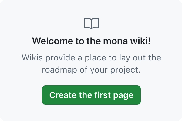
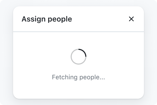
Empty states
Empty states are used to fill spaces when no content has been added yet, or is temporarily empty due to the nature of the feature.
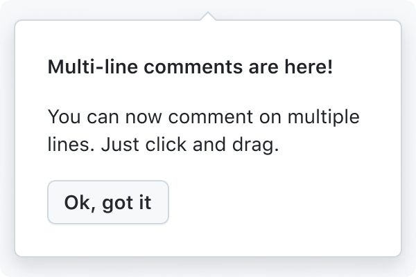
Feature onboarding
Onboarding is a virtual unboxing experience that helps users get started with a feature. This is a guide for designing onboarding for the product and does not include what to do for marketing pages, email announcements, social media, etc.
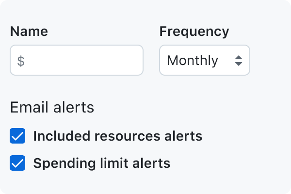
Forms
Primer's form design guidelines aim to minimize the effort and cognitive load required to complete a task that requires data input from the user. For example, creating a new repo configuring settings, and logging in.
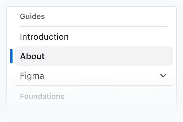
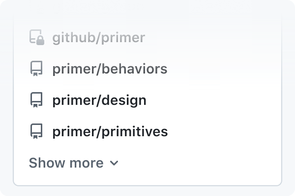
Navigation
Navigation patterns help users understand where they are and where they can go next.
Notification messaging
Messaging components are used to provide important and relevant information to the user, including feedback, contextual information, product updates, and more.
Progressive disclosure
Progressive disclosures are a design pattern that hides and shows information based on user interaction. They should be used sparingly, only when it's necessary to truncate information.
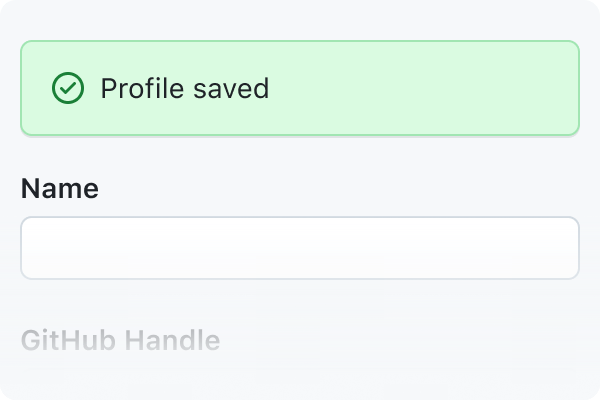
Saving
Save patterns help users store and update their content and configuration throughout GitHub. These changes should be represented in the UI accurately, quickly, and obviously. Their behavior should inspire confidence and trust.